A BOLD VISION OF FLAVOR
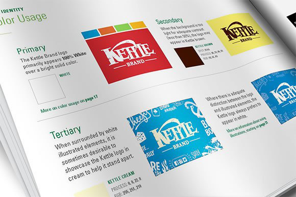
Kettle Brand was in need of an energetic new visual system to support their already established and successful foundational packaging, and to distinguish a clear vision and voice for the brand. The key outcome: bold colors with a strong horizontal motion, reflective of the packaging system, with flavor-forward hand-drawn typography and illustrations.